Friday, April 30, 2010

Comic Book Themed Art
"The DEFENDERS" - 2002
web-site banner header artwork

Welcome!

Today's post is the fifth entry in a series of "flashbacks" at some of my old comic book style artwork.

Previous entries into this series are:

  • A series of magazine cover submission samples from 2000- as seen [HERE]
  • An 11-page comic book story from 1993 - of the "Secret Defenders": - as seen [HERE]
  • A 6-page comic book story from 1989 - featuring one of my earliest takes on "Doctor Strange" - [HERE]
  • A diverse set of 7 drawings, in various styles, going all the way back to a drawing by 13-year-old me from 1980 - [HERE]

*UPDATE*
05-03-2010
(see the end of this post for an additional bonus piece to this set.)


Today's post, is different than those others in a few aspects.

First, these are single "panel" images that were designed exclusively for the purpose of being used as banner headers on a web-site (a message board forum).

They also feature some of my earliest attempts to colorize my artwork via Photoshop.

And, for those who are sick of seeing "Doctor Strange", they also feature some other, perhaps more recognizable Marvel heroes; The Incredible Hulk, Namor the Sub-Mariner and the Silver Surfer.
These four characters are (or were) the central characters in a team called "The DEFENDERS".
The web-site for which these banners were created was a message board dedicated to that team, where fans could gather to discuss anything related to that team: their comic, history and assorted characters.


Drawn one image each month - from January to April 2002, (although, each one didn't take more than a weekend from start to finish - from rough sketches to color final) each image tries to tell a brief story scene.
A different character "headlines" in each image, showcasing that character's unique environs in the background (backgrounds which are only revealed in the final color works).

I will show each, the black and white original artwork and then the colorized final images.

Each original is drawn with
black pencil finals over blue pencil sketches on vellum finish bristol board
13 inches wide x 4 inches high

However, each image, when colored, would then be reduced greatly in size, so I tried to keep them only "moderately detailed".

---
*click pics to enlarge images *
---


---

The art was then scanned into my computer, digitized, colorized in Photoshop (not very well, I'll admit) and then reduced to a mere 600 x 200 pixels.

These color versions are not reduced that far in size, so as to better showcase the detail.

---
*click pics to enlarge images *
---

Doctor Strange's scene is in a vast other-dimensional realm.

Namor the Sub-Mariner's scene is obviously underwater.
* note, Dr. Strange casting a spell to allow Hulk to breathe underwater *

The Hulk's scene is somewhere in the deserts of the American mid-west.

The Silver Surfer's scene is in a vortex in the center of the cosmos.
* note: Dr. Strange is in his "astral form" *


---

As with much of my own work, I am torn in my feelings for these images.
I like certain aspects of some while disliking much of the rest of each image.
Each has strengths and weaknesses that relate to my then inexperience in the digital medium, and experimentation with "creative license" of character aspects and likenesses.

When they were originally posted to the web site for which they were created, they were received - as much in the realm of fandom - with either very positive or very negative reviews.

I'm happy to say that most of the feedback I received was very positive.
Certainly, some critiques were made about certain variations in style or what liberties I took in how I drew a character (which may or may not be in keeping with how any particular fan "envisioned" the character), but only a very small number were overtly negative in their overall review.

Still, with these four images I taught myself how to "silhouette" images in Photoshop (for ease of coloring), the use of layers, playing around with settings and effects and took my first steps into producing work digitally.

Not bad, when you think about it.

*UPDATE*
05-03-2010

I came across this sketch in a folder.
It was the rough start to what this series of DEFENDERS banners would become.
So, it seemed appropriate to include it in this post.


blue pencil on regular 8.5 x 11 photocopy paper

---

That's all for now.

I'll take a step away from the "comic book" themed art for awhile.
We'll change it up and showcase some other styles of work; storyboards, book covers and the like in the next few installments.

I'll come back to comic art soon enough however.
But, I'll try to change it up a bit more often.

Thanks again for stopping by!

Monday, April 26, 2010

Comic Book Themed Art
"Doctor Strange" - 1980 - 1989 -
Roughs, Sketches, and Humble Beginnings.

Welcome, once again, to this, the fourth in a series of "flashbacks" at some of my (VERY) old comic book style artwork.

Previous entries into this series are:
  • A series of magazine cover submission samples from 2000- as seen [HERE]
  • An 11-page comic book story from 1993 - of the "Secret Defenders": - as seen [HERE]
  • A 6-page comic book story from 1989 - featuring one of my earliest takes on "Doctor Strange" - [HERE]

Today's post, unlike the more formal "story"-style entries in this series, is more of an assortment of samples of a few relatively unrelated single images.


However, continuing in the vein of the previous entries, this post also focuses on Marvel comics character, Doctor Strange.
(I promise. I'll get to my own creations soon enough.)

The years represented in these images range from 1989 to as far back as 1980!
And none of them are really all that good.
But, I am trying to show the growth (or more, the "deconstruction" as this series has been in reverse chronological order) as an artist using one character as the control standard.

This first image, from 1988 (or it may have been from 1987) was a rough stab at trying to draw in a "comic page" format.
Like the last entry in this series, I had utilized the "smudge" technique for applying grey tones and rendering shadows.

* click images to make larger *

graphite pencil over blue pencil artwork on bristol board.


I was fascinated by black and white comics that were coming out in that time (early Aircel issues, before they were bought out by Malibu). - Comics like DragonRing, DragonForce and Warlock5 influenced me (as well as the B/W Marvel magazines) and I preferred the black/white/ greytone artwork to the stiff black inked color comics, so this sample is in that grey-tone style that I was using heavily at the time.

Unlike most comic page layouts, this page did not use any sort of grid of panels to break up the "narrative".
Instead, I used the flow of the events to carry the viewers eye around the page in the proper sequence of events.

  • Dr. Strange is sitting, reading a mystic tome.
  • He senses something and releases his "astral form" from his body.
  • That ghostly self floats to a portal (shaped like a scrollwork page) and enters another dimension.
  • There we see Strange's astral form within that otherworldly realm.

The flow of the events is a backwards "S", starting at the top left and ending at the bottom right.

---


This next one was done at around the same time-frame (a few weeks or so before or after) and is simply a "pin-up" image of Strange, levitating in the "lotus" position.

It was around this time that I started producing many such images of other comic characters that I would then hand-color copies of which, and sell at various comic conventions in the USA.


graphite pencil over blue pencil artwork on bristol board

One this that bothers me about this image was that I placed his mustache too high.
It should rest upon his upper lip.

---

These images are all work-up sketches, done either shortly before or shortly after I drew the 6-page "Dr. Strange" story (shown in the previous segment of this series).


rough pencil sketches and concept doodles on smooth finish sketch paper.

No real reason for inclusion of this bit of rough sketches.
It was in a folder with some other old rough samples, and I just felt like tossing it in.

---

I honestly am unsure as to the precise "when" of these two images.
They were also in the folder with the other sketch materials for the 6-page 1989 story, but were definitely done prior to that. I'm guessing 1987.

These two images were different from the other rough materials, in that they were loose watercolor sketches.

Just toying around and playing with various effects and color ranges.
Not any kind of serious "artwork".

Watercolor washes over pencil rough sketch on mild textured sketch paper

Watercolor washes with some india ink linework on mild textured sketch paper.

---


This next piece is very special to me.
It was the first time that I tried to produce an actual submission sample to show to professionals in the comic field.

It's a part of a "story" that I had plotted out, and roughed in the first few pages.
However, this was the only one that was ever completed.

india ink over pencil artwork on bristol board
(and lots of white-out after I went back into it one too many times adding way too many details)


While I'm nearly sure that this was drawn in 1982, as a freshman in high school, (or possibly 1981, as I have several other similarly overly-detailed pen and ink drawings from that time in an old folder,) I placed the 1983 copyright date on the image because I'm really not 100% sure.

What I DO know is that it was this image (and maybe a few others) that I took with me, in 1983, to my first New York City comic convention, where I met several professional comic artists and showed it to one who was an icon in the field.
His name is John Byrne, and at that time (and for many years before and since) he was at the very pinnacle of his craft and his standing as one of the very best in the biz.

I remember his walking up to me in a dimly lit speaker's room, as he had seen that I was awkwardly holding an artist's portfolio, and my feebly asking if he wouldn't mind taking a look at what I had drawn.

We walked over into the doorway, where the light from the larger, dealer's area would shed some light on my work. He looked at the artwork and told me generally positive things about it.
He most likely pointed out that I'd need to work on some things or other. Probably the inking technique, as I'd only shortly before had obtained a set of 'Rapidograph' ink pens. I'm unsure of his specific critique, (because it was over 27 years ago,) but all-in-all he treated me very nicely and constructively.


To be dead-to-rights, he should have (although he may have) called me on the fact that I had no differentiation of line quality or width.
It's hard to tell one thing apart from another because I was using only a few different, fine point nibs in my inks.
Also, the perspective is all wrong on the window and background.

Still, looking at it now, I'm fairly impressed that I got the anatomy so well done on the main figure (I won't mention the little nude figures on the incense brazier).

To wrap up my anecdote; after he gave me encouragement for the piece, I then got his autograph on some comics and considered it a very good day indeed.

---

This last piece was drawn in 1980.
It is the very first drawing that I ever had attempted of the character that I had only discovered scant months before.

Based upon a published comic book cover (by one of my all time favorite artists; Michael Golden), I drew my own version of the figure that was seen on this cover:

Doctor Strange # 42. 1980. Cover art by Michael Golden.


I had recently turned 13 (judging by the date on my piece) and I recall that I was very pleased with the initial pencil and line-art marker work (although the marker bled a bit into the soft textured paper).

However, when I tried to color it with a new set of markers that I had received as a gift a few weeks before... well... I ruined it.
Some of the colored markers bled into the paper, while others had already become dried out from my constant usage - making even-toned coloring impossible.

My version I now show here - warts and all.

pencils and magic markers on soft sketchpad paper


Obviously, I didn't draw the dragon in my version.
Not sure why not.
I know that the challenge of the detail woul dhave been right up my alley.

If I had to guess, I'd say that either;
  • a) I didn't leave enough room for it
  • b) I was eager to complete the drawing
  • c) both A and B.

---

And so, I bring to an end this batch of fairly embarrassing, tentative forays onto the word of comic book art.

I have one last batch of "Doctor Strange" related images to share next time.
But they are more "modern".
From 2002, and were made as banner headers for a website and were my first attempts at using Photoshop to colorize my work.

I'll post those in a few days time.
Afterwards, I'll change gears again for awhile, and showcase some other styles of work; storyboards, book covers and the like.

Thanks for stopping by!

Thursday, April 22, 2010

HEAD IN THE CLOUDS
Greeting Card Designs - 1991
An EARTH DAY Special

Changing direction today, I thought it more than appropriate to showcase some old greeting card designs that I created way back in 1991. These were for my own line of cards, which I had every hope and intention of having printed on recycled paper.

So intent with what I hoped to be a "simple" pro-Earth business plan that I made the logo to feature a very basic depiction of one of the characters, standing on a globe and "hugging" a tree.


The line of cards was dubbed:
"HEAD IN THE CLOUDS"
since all the characters had "balloon-heads".

These illustrations (as I'll show below) were first created back in 1991, yet I feel completely assured that they are still more than viable today - nearly 20 years later.

Certainly, while I'd like to rework newer versions of them, if only because my abilities have increased, I don't feel that they really "need" to be (outside of my own neurotic "perfectionist" tendencies since I see places where improvements could be made).

I worked these up in two different styles.
The first, being a fun, friendly style - similar to one of my "children's book" styles - with short, stout, bouncy, full figures and bright colors.
The second, like the logo for the line is very basic - little more than simple blocky stick figures with little, if any color.

All of these pieces are drawn on bristol finish illustration board, first in pencil, then watercolored and finally with pencil again over the watercolors to ensure the line-work isn't washed out.

Many of these card designs are fairly self-explanatory, but the inside message for each is included.


---

"Please Write"


---

"Thinking of You"


---

"Bon Voyage"


---

"Get Well Soon"


---

"Hi"

---
" I Love You"


---
"I love You, Mom. Happy Mother's Day"


---
"Congratulations!"
"Many Blessings to You and Your Little One."

---
"Happy Birthday!"
Birthday Card
Exterior (above) and Interior (below)
*click to enlarge*


And, lastly... the design that got me started with the line... and one of the reasons I am posting these today: EARTH DAY!

---
EARTH DAY
"Help Support Our World"


---

I had, back in the early 1990's, sent these samples to many greeting card companies, (starting with those who printed on recycled paper,) but one after another, rejection letters arrived - a few actually stating that they found the style of subject matter: "headless" figures, to be... "disturbing".

Unfortunately, no one "got" the concept. These weren't headless figures. Their heads were balloons. And as such, could have a unique method of expression.

I had many more ideas for this line, but it came to a halt when it became obvious that this was just too "out there" for some.

Oddly enough, a few years after my ideas were shot down, I would then see other types of "balloon head" characters (mostly in advertising : some cold or alergy medicine commercial that stated it didn't give a "swollen head" feeling -which would show the person's head expanding like a balloon - and "AirHeads" candy that, when eaten by kids, caused their heads to expand like balloons and shoot off into the stratosphere, causing damage to anything in their way).

I know that certainly, more "disturbing" characters than these have been created and successfully marketed in the years since.
It's not the first time that I (or any artist) was simply "ahead of my time", with my...
HEAD IN THE CLOUDS.

Monday, April 19, 2010

"Doctor Strange" - 1989
More Comic Book Style Illustrations
A 6-page Submission Sample

---

Welcome, once again, to this the third in a series of "flashbacks" at some of my old comic book style artwork.

Today is a 6-page short story sample that I "wrote" (a plot outline) and drew back in 1989 (or it might have been 1988 - sadly, I can't provide an actual date for these, but I know it was one of those two years - late '88 or early '89.)

Previous entries into this series are:
  • A series of magazine cover submission samples - as seen [HERE]
  • An 11-page comic book story featuring my own take on the "Secret Defenders: - as seen [HERE]

Continuing in the vein of the previous entries, this post also focuses on Marvel comics character, Doctor Strange.

Trust me, I DO have other works, of other characters, including my own original creations. I'm just working down the history of these Dr. Strange samples first.
This is primarily so you can get a better vantage point of how my work (hopefully) advanced over time, and since it deals with the same character, it makes it easier to notice any differences.
(Although, since we're "turning back the clock", we'll see that in reverse.)

A few differences you'll be able to notice right from the start.
In this sample (which is even older than the previous entries), the first 2 pages are rendered with a lot of grey-tone pencil "smudging".
That was a technique that I was highly fond of (still am, to a certain extent), and is basically made by using rolled up stylus' of special paper that would help you use your pencil work to add shading and depth to your line art.

However, by the third page, for some reason or other, I halted that technique and just stuck with a more traditional style.

I'll get into more on the "smudge style" and grey-tone rendering as a whole after the art pages.


One last thing before we start, like the last entry, I'll give a basic biography for the characters in the tale.

The cast of characters are (in order of appearance):

---

Doctor Strange
Master of the Mystic Arts
and Sorcerer Supreme
of the Marvel comics "universe".

---

The Ancient One
Dr. Strange's mentor.
He held the mantle of Sorcerer Supreme long before (for over 400 years).
Now deceased. Is currently "One with the Universe".

---

Clea
Other-dimensional princess of the "Dark Dimension".
(At the time of this story, she had recently become "Queen" and wears the "flames of regency" upon her head as a crown of her position.)
She has been Dr. Strange's love for some time.

---

Dormammu
Flame-headed tyrant overlord of the Dark Dimension.
Scourge of untold realms.
Dr. Strange is his primary obstacle for taking over our earthly plane.

---

Eternity
The "Living Embodiment" of the Universe.
He is ALL there is.

---

Nightmare
He is as his name and title decree.
The ruler of the realm of sleep where Nightmares run rampant.
He never ceases to try and rule to our reality.

---

Now that we know who's who, let's begin.


*click pics to enlarge *


---
page 1 of 6
---


Panel one:
Dr. Strange gazes into his magical "Orb".

Panel two:
Suddenly, an image of his dead master; the Ancient One, appears in the sphere.

Panel three:
The Ancient One tells his former pupil that a danger is lurking in between realities.
One that threatens to destroy the world.

Panel four:
As the visage of his aged master fades from view, Strange ruminates upon the dilemma while looking out of his Sanctum's uniquely shaped window.


---
page 2 of 6
---


Panel one:
While Strange broods over his task, his love, Clea appears through a dimensional aperture.

Panel two:
Strange looks solomn. Heavy is his burden.

Panel three:
She can't bear to see him like this and in a loving embrace tries to help soothe his mind.

Panel four:
As he vanishes into tendrils of smokey magic, he tells he that loves her and vows to return to her.

Panel five:
Now left holding empty air, Clea is nearly heartbroken over the thought that one day he may never return.


---
page 3 of 6
---


Panel one:
Appearing in a doorway that looms over the pathways to many realms of reality, Dr. Strange uses his mystic "Eye of Agamotto" medallion to peer into the void.

Panel two, three and four:
Strange walks the unending byways in search of any clues as to the name or nature of the danger his master forewarned.

Panel five:
A mystic alarm is raised in his consciousness! His "Eye of Agamotto"is open and alert! The mystic sign of the "ankh" appearing upon his brow (which it would only in the most dire of circumstances)...


---
page 4 of 6
---


Panel one:
Dr. Strange quickly conjures forth a protective shield, which is just as quickly shattered.

Panel two:
Trying to maintain a protective spell, Strange is barraged by an overpowering display of force which smashes him to the ground.

Panel three:
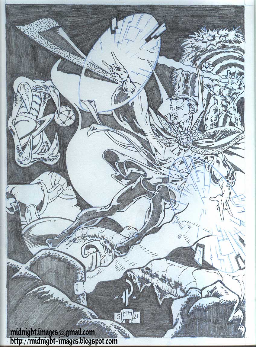
While all Strange can do is crawl backward, the flaming head and hands of the Dread Dormammu rises before him... menacingly.

Panel four:
As Dormammu attempts to grab him, Strange casts a sphere of protection about himself.

Panel five:
Releasing the "Eye" from its housing in his amulet, Strange begind the incantation which will call forth (from the realm that can be accessed inside the amulet) the one entity who can defeat this arch foe.


---
page 5 of 6
---


Note: This page is laid out using a non-traditional method of moving the reader's eye from place to place which allows them to "follow" the events in the proper order.

Panel one:
Strange in engulfed in cascading light as he allows the amulet to grow and expand from its place at his throat.

Panel two:
Emerging from the other-realm that exists beyond the amulet, steps forth Eternity - he who has bested Dormammu before. Sensing his defeat, Dormammu cringes back upon seeing this impossible foe.

Panel three:
Dormammu screams his outrage...

Panel four:
...as he is dragged by Eternity into the dimensional portal within the amulet.

---
page 6 of 6
---

Panel one:
Returning the amulet to its proper place and closing its "Eye", Dr. Strange also closes the access to the other dimensions - returning to our world.

Panel two:
Walking up the stairs to his study, Strange casts a spell, sealing the way to the other realms.

Panel three:
Entering his study, he finds Clea asleep on the floor.

Panel four:
As he gently awakens her with a kiss, the two lovers share an intimate moment of passion.

Panel five:
Now adrift in slumber... are they now to be beset upon by Nightmare?


---
THE END ?
---


--- A FEW WORDS ABOUT THE WORK ---

Similar to the previous entry in this "flashback" series (the 1993 "Secret Defenders" story), this short tale has no room for lengthy plot points, intricate story or anything beyond "the basics".
It is even more reliant upon hitting the story "beats" quickly as it is only 6 pages - as opposed to the 11-page length of the previous entry.

6 pages was an average length for minor back-up features in comic books. Especially if the issue is an anthology or a "shared" title with more than one "headliner".

As is often the case when I work up samples, I try to produce them in "real time". Meaning: I endevor to produce a page a day - which was an industry standard.
(Sadly, these days that rate of production is a lofty dream - as artists grow ever more detailed [or as is sometimes the case... lax] - in their work.)

I seem to remember going back to rework some pages after they were "done" and causing my pages to back-log a bit, so that by page 5 I was in need of something big, bold and quick to pick up the pace.
My experimentation with the storytelling on page five only "half-worked".
It could have worked, except that I don't think it was all that good.

The other down-side to that reworking is that there was far too much detail in the final pieces.
I was still getting the hang of it at this point, but comics are drawn (like these pages) at a size of 10 inches wide by 15 inches high (on an 11 x 17 board) and then, after inks and colors are added would be reproduced much smaller - (the modern comic size being approximately 6.5 x 10.25 inches).
All that detail would blur together if it were to be used in an actual comic (at least one printed back in 1989).

Aside from that, as a purely "full-size" presentation, I think this would have looked better if I had continued it in the "smudge" technique.
At the very least, it would have helped hide a multitude of sins.
(Some of them, like the "stairs" that lead up to the corner window "seats") to the far left of panel 1 on page 2 were just painfully bad.)


--- THE "SMUDGE" TECHNIQUE ---

On a slightly technical note, the smudge technique was a complicated thing back in those days.
Simply stated, most comic printers couldn't work with them.

Also, most publishers and submissions editors refused to look at anything rendered in grey tones (whether by smudge or by grey-tone markers). They want to see good, clear, understandable artwork - and many an artist (myself included) would try to hide poor drawings with a multitude of "tricks" - such as the smudge.

I always believed that if penciled dark enough, and clear enough, any printer could use finished pencils (with grey-tones or not) to reproduce for publication. The grey-tone "rendering" would have worked as well - if the printer was advanced enough, the plates they used good enough and the paper of a decent quality.


However, when these were drawn, the plates that were created to print the artwork were of cheap plastic for budgetary reasons, and paper was frequently poor - all of which made "artsy" pencils like these look like mud - IF they reproduced at all.

Simply put, unless a project was specially arranged in advance to be drawn like this... it just didn't happen.
(Oddly enough, the few times back then that such artwork was commissioned professionally, the printers couldn't seem to reproduce it well anyway.


Such advances in the medium would take over another decade.

Every so often, I'll work up pieces (pin-ups and other stuff) and use the smudge style, and with the scanners and printers available now (heck, even good photocopiers can reproduce the technique fairly faithfully so) it's not a worry.
(However, with the advance of photoshop "inking and coloring" methods, the simple smudge style of rendering can be done digitally.)


--- A FAMOUS CRITIC ---

I'll wrap up this entry with an anecdote about how I met STAN LEE (he who co-crated much of the Marvel comics characters, like the Fantastic Four, Spider-Man, Hulk and many others... including Doctor Strange) and how he gave me a portfolio review.

(That day, I also met JACK "KING" KIRBY - the man largely responsible for co-creating much of the same characters and worlds that Stan would write about - if not even more of the visual nature of comics themselves - but this isn't the time for the story of that meeting.)

From a period of 1988 - 1992, I would frequently travel to various comic conventions and have a table set up in either the dealer's room or, later, in the professional's "Artist's Alley".
One such convention both Stan Lee and Jack Kirby were in attendance!
(For some reason, I seem to think this was either in Chicago or Boston - except that if both Stan and Jack were present - it was more likely in New York City.)

It was announced that Stan Lee would be conducting portfolio reviews for a few hours that day, and so, many artists in attendance registered, were assigned a time-slot and then had their own private freak-outs while waiting for their time.

When it was finally my turn, Stan was as boisterously pleasant and friendly as his public persona has always been. Quick with a smile and a handshake.

I sat down and he flipped through my book - I recall it being fairly daunting that many of the images that he was seeing - mostly pin-up style drawings - were of characters that he co-created with some of the greatest comic artists ever known.

Luckily, I didn't freeze up or panic (or worse... "geek out"). Stan made it easy to just be at ease.
As Stan flipped, and had a few "Ah... good." and "This is nice." comments, we finally reached the portion with the actual comic artwork.
The only problem is that, by now, the almost surreal nature of this meeting was starting to get to me a little.


When he reached this sample, and he got to page three, he simply said; "Ahh... Doctor Strange! His legs are too thin."

All I could say was..." No. I don't think so." (because I was thinking that as a sorcerer, Strange should be leaner and less bulked up - as opposed to the traditional "superheroes" in comics).
However, I immediately realized that my own, personal thoughts on the proper handling of a magic-user character, were not appropriate for this meeting, and so I quickly added, "Really? Hmmm... Well, I guess so. YOU would know, right?"

He took my gaff in stride, but I didn't hear anything else he said during my time with him.
I was far too shaken by my own hubris and kept repeating the blurted words over and over in my head.
Finally, we reached the end of the portfolio, he smiled and told me to keep up the good work ("Marvel needs up and comic young artists like you!" - or some words to that effect, were the last thing he said to me.)
We shook hands again (and I think he gave me his business card - I mean I have one of his for his then California offices - how else did I get it?) and I walked back to my booth.


Looking at these pages now, I know that Stan was being far too easy on me.
To only pick up on the fact that his character's legs were thin was a kindness!
It could have (should have) been much worse of a critique.
But, Stan was being nice to an idiot young guy.

(I can pick a multitude of flaws from the pages - all of which glare at me now.)

To this day, that small snippet of our meeting is the only thing that I can remember with clarity.
And even though, I really DO feel that Doctor Strange should be portrayed as a more "wizardly" character (spending more time reading dusty old tomes than getting out to walk - and when he does battle it isn't usually done physically) I learned the valuable lesson that unless you are being granted artistic license to do so, it is best to write or draw trademarked characters as they are - not how you think they should be.

At least when showing them to the guy that pretty much created them anyway.

Sunday, April 11, 2010

"Secret Defenders" - 1993
Comic book style illustrations
Panel-by-Panel continuity storytelling

---

Continuing in the vein of the previous entry of comic book style illustrations
(a series of magazine cover submission samples - as seen [HERE])
today I present a sample of comic book page art with an 11-page submission (11 pages being a typical length of a "back-up" or secondary feature) of pencil artwork (of a short story of my own creation) that I worked up to present at Marvel comics back in 1993.

It is traditional comic-page art - what is known in the industry as "panel-by-panel continuity" - in which the artist draws the series of events that take place in the story (as written either as a basic plot or a full script) in order to present the narrative in a linear, visual manner for the reader.

From a purely technical aspect, the work is done in black pencil over blue pencil roughs. All drawn on vellum finish bristol illustration board.
The pages are drawn at a size of 10 inches wide by 15 inches high (on an 11 x 17 board), and would then be inked (an inker finalizes the art in permanent india ink) lettered and colored - then shrunk down to comic size for final printing (the modern comic size being approximately 6.5 x 10.25 inches).

I should note that there is a certain skill-set that has been recognized as being a factor to read comic books and "follow" the artwork - essentially knowing the visual "language" of how a comic page is laid out. Some people just can't do it.
Add to that sometime confusion, the fact that English (usually American) comics are read differently than eastern (traditionally Japanese) comics (there called "manga").
I won't go into the "backwards" nature of manga here - as it doesn't apply.

In these samples, like most American comics, the flow of action is read from left to right, top to bottom (much like a standard text-only book). The confusion sometimes comes in where oddly sized panels (sometimes called "frames" or "boxes" by non-comic readers) are utilized or some other visual trick that is meant to direct the reader's eye through the page. (Never mind the perceived chaos of double-page spreads - since I don't have any here.)

These pages are set up in a fairly straightforward manner, not too many tricks in the bunch, so it should be easy to follow along.

Even though I "wrote" the story myself (as a basic plot), I don't have any text present on the pages, instead allowing for the pictures to tell the tale.
For your convenience, I will give page breakdowns of what is transpiring, since I don't expect anyone but die-hard comic readers to be able to know what is going on.

One last thing; I should give a brief "bio" of the characters in the story just so you'll have an idea of who they are and what they do.

The cast of characters are:

---

Doctor Strange
Master of the Mystic Arts
and Sorcerer Supreme
of the Marvel comics "universe".
(I presented illustrations of him in the previous post entry [HERE])

During the time-frame that this story took place (1993) he was in a state of having lesser power and used an enchanted tarot deck to determine who he would assemble for his "team" of "Secret Defenders" to confront the task at hand.

---

The Man-Thing
A swamp creature who is guardian to a "nexus" located in the Florida Everglades.
He used to be a man.
While now nearly mindless, he reacts to emotions of those around him.
The most important thing to know is that:
"Whoever knows fear... BURNS at the touch of the Man-Thing"


---

Scarlet Witch
While she has studied the practice of actual magic,
she is primarily a mutant,
born with a power that allows her to cast "hexes" which affect probabilities.
(Basically she can cause the unlikely and/or the impossible to occur.)


---

Spider-Man
Everyone knows Spider-Man.
Climbs walls. Shoots webs. Fast and Strong.

---

OK. Everyone up to speed?
Then let's proceed.

*click pics to make Giant-Sized *


---
page 1 of 11
---


Top of page (panel 1):
As we view the swampy landscape of the Florida Everglades we see the Man-Thing trudging through the murky waters of his home.

Bottom of page (panel 2):
He comes across a strange, almost alien object in the heart of the swamp.
A crystalline artifact of strange power that eminates with the energies of the "nexus" which he protects.
It is unnatural for it to be here.


---
page 2 of 11
---


Panel 1:
Instinctively sensing its "otherness", as it is somehow accessing to the nexus' mystic energies, the Man-Thing reaches out to touch the mirrored object, which seems to beckon to him.

Panel 2:
Making contact with the surface of the crystal, a transfer of energies occurs between the item and the Man-Thing.

Panel 3:
Behind his otherwise vacant eyes, the long-dormant human self of the Man-Thing regains consciousness.

Panel 4:
Now semi-aware, the power of the nexus erupts from the body of the creature, sending him into a paroxysmal attack.

Panel 5:
The entire swamp is alight with mystical energies, while in the distance a storm gathers ...


---
Page 3 of 11
---


Panel 1:
Stormy weather in New York City, as we view the edifice of the Greenwich Village home (the Sanctum Sanctorum) of Doctor Strange.

Panel 2:
Inside his study we see the master of mysticism levitating and in observation of the Man-Thing's plight via his mystical Orb.

Panel 3:
Utilizing his enchanted deck of tarot cards he calls them forth as well as his "Eye of Agamotto" (his mystic "3rd eye") to see the truth of what the cards reveal.
Four cards show him who he should summon to aid him in the task of saving Man-Thing and stopping whatever it is that has done this to him/it.

Panel 4:
Having seen the cards, Strange takes a moment to reflect and prepare.
(in a caption that is not present, he states that two of the cards showed his own image and that of the  Man-Thing "reversed" - an upside-down image in tarot cards usually alluding to an opposite aspect of the card's image).


---
Page 4 of 11
---


Panel 1:
Releasing his ghostly "astral form" from his physical body, Dr. Strange flies out of his Sanctum (through the distinctively shaped window) into the city to contact the remaining two heroes that the cards has revealed to him.

Panel (row) 2:
Spider-Man (revealed as the Knight of Swords) is hanging on a wall when the astral form of Dr Strange passes through him and explains the situation. Spider-man agrees, grabs Strange's hand and they vanish.

Panel (row) 3:
The Scarlet Witch (shown as the Queen of Cups) is reclining in bed with a magic tome. Strange rises from the smoke of her candle to bid her a greeting and beg her aid. She assents and they too vanish in a cloud of smoke.


---
Page 5 of 11
---


Panel 1:
The group appear together, ready for action, in a swirling cloud of magical smoke.
Dr Strange is once again in his physical body.

Panel 2:
They are in Dr Strange's Sanctum and he gestures to a doorway that shall lead them to where they need to go.

Panel 3:
Strange casts a magical spell to open the portal...

Panel 4:
...revealing a series of pathways (like an MC Escher landscape) where the physical laws hold no bearing.

Panel 5:
They pass into the portal, Spider-man giving a backwards glance (and most likely a joke) as reality goes topsy-turvy.


---
Page 6 of 11
---


Panel 1:
As the Man-Thing is still suffering convulsions of explosive energies, a doorway of light opens into the swamp and the three heroes emerge.

Panel 2:
Doctor Strange instructs Spider-Man to occupy the Man-Thing and to keep him away from the crystalline object while the Scarlet Witch acts as his aid in a mystical solution.

Panel 3:
Spider-Man rushes off to his physical confrontation while Scarlet Witch and Dr Strange begin their mystical tasks.


---
Page 7 of 11
---


Panel 1:
Spider-Man puts himself between the Man-Thing and the object of his desire/torment.

Panel 2:
With Scarlet Witch protecting his physical form, Dr Strange lets his astral form free.

Panel 3:
As Strange's astral body enters into the mind of the Man-Thing, it sets off a flare of awareness in the eyes of the Man-Thing - the energies from the crystal protecting themselves - ...

Panel 4:
...which cause Man-Thing to lash out!
Spider-man leaps out of the way and...

Panel 5:
tries to subdue the Man-Thing.
(not an easy task as Man-Thing is made of swamp and impervious to physical harm - Spider-Man's fist passing right through the swamp creature's head.)


---
Page 8 of 11
---


Panel 1:
Flipping over the Man-Thing, to once again position himself between him/it and the crystal, Spider-man also shoots webs at the Man-Thing trying to snare it against a tree.

Panel (insets) 2, 3 and 4:
Man-Thing uses his mucky form to ooze out of the web-trap and vanish into the swamp waters.

Panel 5:
Only to emerge in a rage of motion tossing Spider-Man out of the way.

Panel 6:
Spider-Man, using a web-line to swing around a tree brings himself back to the battle.

Panel 7:
Unfortunately, he gets mired, once again, in the Man-Thing's muck-encrusted form.

Panel 8:
Spider-man looks at the two heroes in the background and wonders just what Dr Strange is doing to rectify this situation.


---
Page 9 of 11
---


Panel 1:
Dr Strange in his astral form is making his way through the terrifying corridors of the Man-Thing's mindscape. His floating "Eye of Agamotto" leading a pathway through the dangers.

Panel 2:
Strange cats a spell...

Panel 3:
...sending these assorted horrors away, screaming... out of the Man-Thing's mind.

Panel 4:
The way now made clear, a light shines in a distant chamber... the very center of the Man-Thing's being.

Panel 5:
Entering the doorway, Dr Strange, views the Man-Thing in combat with his own human nature, while the energies of the Nexus cascade in a pillar of power in the center of the room.

Panel 6:
The Man-Thing's human self sees Dr Strange and warns him off, Strange trying to reach him.


---
Page 10 of 11
---


Panel 1:
Now aware... and AFRAID, Man-Thing's human self is set aflame by the mental aspect of the Man-Thing - burning away layers of humanity until only an infant remains.

Panel 2:
Strange looks solemnly, noting the loss of the adult man who was trapped inside the monster.

Panel 3:
Doctor Strange takes the infant and carefully places him, upside down (in a birthing position) within the energies of the nexus.

Panel 4:
With a tearful wave, Man-Thing bids goodbye (and thank you) to Doctor Strange as the mystic vanishes from his fading mind.

Panel 5:
Emerging from the Man-Thing's body, Strange passes over Spider-Man - who now realizes that Man-Thing has stopped fighting.

Panel 6:
Reuniting with his own physical form, Dr Strange instructs the Scarlet Witch to cast her hex upon the Man-Thing.


---
Page 11 of 11
---


Panel 1:
Scarlet Witch casts a gentle hex upon Man-Thing, which causes the fractured energies that were being emitted to form into a cohesive single pillar of energy - the nexus made manifest.

Panel 2:
Emerging from the Man-Thing, the infant form of his own human self is born anew.

Panel 3:
The three heroes "midwife" the baby casting loving looks upon him (while Spider-man makes funny gestures).

Panel 4:
Despite a hesitant warning from Scarlet Witch, Doctor Strange presents the infant to the care of the Man-Thing, who receives the infant lovingly.

Panel 5:
Strange turns to the crystal mirror that was the cause of all the previous events, and sees his own reflection - teasing, tantalizing and tormenting him in the form of the multitudes of ways that he has appeared over the years, a slideshow of his every possible moment, for good or ill ...

Panel 6:
...and he smashes it into a thousand glittering shards!

Panel 7:
While Spider-Man looks behind him, wondering if they did the right thing, Dr Strange assures them that the Man-Thing is the best caretaker for the infant. They vanish...

Panel 8:
...leaving the now near mindless Man-Thing, once again as the guardian, not only of the nexus, but of his own newborn self.

- The End -


Obviously, I had a pitch that I was going to propose wherein this would lead to a new Man-Thing series, with his assorted supporting cast, usually misfits and outcasts themselves, helping him in the gathering of assorted people of power and abilities - from myriad realities - thus forming a new "Guardianship" of the nexus.

However, no publisher receives unsolicited stories, so I had to leave all that behind and just send this art sample.

I received some favorable replies, some with suggestions and wishes to see more samples, but for the most part, comics were starting to take a downward turn, sales-wise, around that time. In three years, Marvel would file for bankruptcy, from which it would take them several years to emerge.

---

I should note that normally, pencil pages aren't so... "final" looking. Usually, pencils are fairly lightly done, with blacked in areas only lightly marked.
I penciled these pages very darkly, so they would reproduce well in photocopies.

As for the style of artwork presented here, it isn't truly in my normal style.
Extraneous cross-hatching was very "in vogue" during those years, and as such I tossed in a lot of extra hatch marks to "match up" with the then-current trend.
If you look at the art and remove the crosshatching, the artwork is relatively clean and clear.

There were some visual tricks that I did employ in my storytelling.
Some I was happy with , others, not so much.

I was happy with the concept of the panels from page 4; showing the character as they had appeared to Dr Strange on the cards. And then the panel shapes gradually turn more upright like traditional comic panels.
I liked the idea of it, but the very small size of the ensuing panels made it hard to leave enough room for any text that might be required.

Also, in my rush to complete these in a timely manner (I tried to complete one page per day - an average in the field [some might say above average these days]), I left some details out or rushed through others. Some backgrounds are sparse. Others, like the Escher-esque staircase chamber could have been done better. Some figures (mostly smaller figures, like those of Strange and the Witch while in the swamp, are sketchy at best.

Under normal operations the inker (the person who finalizes the artwork in ink) or the colorist would fill in the blanks and fix any rushed errors.
However, a submission sample can't rely on those other professionals to make it look good.
It needs to be as perfect as it can be on its own.
And as such, my submission wasn't quite up to professional publishing standards - or my own.

Still, other tricks of the trade that I employed here, I did (and do) find pleasing;
I frequently broke through the confines of the panels, and pages, allowing characters to seemingly leap forth from their 2-dimensional space. It's a fairly common artistic device, but one that I enjoy.

There are a few other bits that I find that I still like.
The first panel of page 4. Strange's astral form going through his window, in the rain is a favorite of mine.
Another is the start of page 9 with the weird landscape that Strange has to circumnavigate with the bizarre creatures inside the mind of the Man-Thing.
Man-Thing giving "birth" has a certain look that I think worked well (the lighting, the pose and the overall effect).
And I can't help but laugh at Spider-Man making "faces"' at the baby on page 11.

But I leave it to you, the viewer, to tell me of your thoughts.

Wednesday, April 7, 2010

Comic book style illustrations
Wizard cover submissions - 2000


Today's post is one that ties into two previous posts, and sets up more upcoming posts.
A pivot-post you might call it.
(Or... you might not. But I will. And I just did.)

Those two previous posts were:

  • - the 2nd post on this blog (from a month ago - seen [HERE]) which teased this content with one image of a comic-book character illustration.
  • - and one from just a few days ago [HERE] which showcased a "series" of illustrations of hands.

That last post mentioned that the next-to-last of those illustrations was done during a time when I was in the midst of an artistic renewal (the year 2000).

These images were a part of that renewed era and were done at nearly the same time.

As an added bonus, in addition to showing the four drawings, I'll also show the various sketches and rough stages that lead up to the final works.
Thus allowing a "behind-the-scenes" look at the process.

These four pieces were drawings that I had submitted to Wizard magazine, a comic-book industry mag, for a cover contest back in 2000. They asked for artists to draw a comic book character (possibly their favorite character - mine being the Marvel comics mystic, Doctor Strange) for a shot to win a commission to draw an actual cover for the magazine that would see print.

I didn't win.
As far as I could tell from my delivery confirmation slip... they never even made it there.

First I'll just show the four final pieces, and then the breakdown of sketch processes.

*click on images to see larger*

Doctor Strange - cover 1
April 13, 2000
graphite pencil over blue-line pencils
on vellum-finish bristol board
approximately 8 x 11.5 inches

---

Doctor Strange - variant background
May 20, 2000
graphite pencil over blue-line pencils
on vellum-finish bristol board
approximately 8 x 11.5 inches

---

Doctor Strange - vs- Mindless Ones
May 21, 2000
graphite pencil over blue-line pencils
on vellum-finish bristol board
approximately 8 x 11.5 inches

---

Doctor Strange - "Art Nouveau"
May 22, 2000
graphite pencil over blue-line pencils
on vellum-finish bristol board
approximately 8 x 11.5 inches

---

I don't have the originals of the finished pieces. These scans were made before I mailed the art away.
However, I do have the sketch materials and those are newly scanned.

---

As with any project of this sort, it's always best to start off with a basic thumbnail sketch.
Just a very rough concept doodle that quickly gets your idea onto paper.

This was what I first envisioned:


ballpoint pen doodle

This rough sketch of the layout has the main figure taking up most of the cover, with open space on the left side for feature blurbs and room up top for the logo.

I almost always do my rough sketches with ballpoint pen, as I like the way the pen flows with little resistance and never requires sharpening. Although, I will admit that this thumbnail is far rougher than most that I do.
Most of the time I pour serious attention and detail into my ballpoint pen roughs.

Next, I sketched a more detailed rough image, in the appropriate size of what the final image should be.

pencil rough sketch

This was pretty much what I wanted, but I had a few things that required tweaking.
One of which was the lighting style for the fingers on his left hand.
So, I quickly worked up these two slight variations to see which one would look best to me.

subtle variations of lighting fx

It seems that I obviously favored the one on the left, because I didn't even continue finishing the other one.

That decision made, I proceeded to work up the final piece, first by drawing everything in light blue pencil.


blue pencil drawing

There are two reasons why I use blue pencil for the preliminary drawing;

  • - it's outdated now, with the advances of color copying and scanning, but in "pre-computer" days, blue lines didn't photocopy or print. So if an artist worked his original pencils in blue, and then they were inked over in black india ink (as was the common practice) and printed, only the black ink work would print - the blue lines not being able to be "seen" by the printer. It's a habit I never stopped. It still works a bit now, because the blue lines can be made very faint and still won't show up (or can be removed in photoshop).

  • - much like the ballpoint pen, the blue pencil flows smoothly over the paper - its "lead" being more waxy than traditional black graphite pencils.

Finally, I went over the blue-lines with black pencil to create the "finished" product.
(I put "finished" in quotes because normally, it would then be inked and then colored - AND also because I didn't feel it really was quite complete.)


Doctor Strange - cover 1
April 13, 2000
graphite pencil over blue-line pencils
on vellum-finish bristol board
approximately 8 x 11.5 inches

---

I still felt that it needed something.
But, I had other projects and work that would take me away from this project for about a month, and I would return to it as soon as I could.

Knowing that a background image or pattern would help complete the work, and that if it were to be used as a cover it could be reduced in opacity to prevent it from being too distracting, I produced a second drawing working from the rough original and added a nice element of design that really tied it all together.

blue pencil drawing

---

The primary design element in that new background is of a familiar nature for that character, being the window-shape of his home. The border-element is one that I created, utilizing a basic design aspect of the "Eye of Agamotto" medallion that he wears about his neck. Thus I was able to create an interesting background that would resonate with those familiar with the character, while being visually interesting to those who might not know anything about him.


Doctor Strange - variant background
May 20, 2000
graphite pencil over blue-line pencils
on vellum-finish bristol board
approximately 8 x 11.5 inches

---

At the same time that I was reworking ideas for a background design on that piece, I also had the need to create new and better illustrations (as like many artists, once I was finished with the previous one, I saw all the flaws present and hated it).

Knowing that, like my intricate design background of the earlier drawing, the publisher could easily reduce the opacity of any part of the drawing and have the main figure remain at 100%.
So, to that extent, I went a little crazy and produced a other-dimensional battle scene.

blue pencil rough lines with graphite pencil and black felt tip marker on sketchbook paper


---


If you take a close look at this sketch, it has many layers of line-types all reworking toward a cohesive final image.
The blue pencil lines are wild and rough, placing figures and things in approximate areas. The black pencil adding tighter details and finalizing placements. The felt-tip marker adding final details and outlines.

This was actually one of two simultaneous roughs for that drawing, as I also worked a "naked" body drawing for the main figure on a separate sheet of paper. It's good practice to draw an accurate human form and then build the clothing over it. Especially if, like this character, the costume is loose and flowing.

blue pencil rough
(note the added hands - which were for the last of the 4 illustrations - as you'll see.)
No idea why I burnt the corner of the paper.

---

Then, I redrew it all, tightening up all the details and elements, in blue pencil...

blue pencil on bristol board

... and then went over it all in black pencil to finalize.

Doctor Strange - vs- Mindless Ones
May 21, 2000
graphite pencil over blue-line pencils
on vellum-finish bristol board
approximately 8 x 11.5 inches

---

Knowing that I got a little carried away with that previous image, I thought I had best work up one final image, more traditional in nature to a magazine cover, but still with an interesting background design.

I've long been a fan of the "Art Nouveau" style made famous by artist Alphonse Mucha, and thought that its flowing and intricate style would be a perfect fit for a sorcerer like Dr. Strange. So, I started working on the new image with that in mind.

blue pencil rough

Starting with a basic concept sketch, I just roughed in the figure and some approximation of design elements. This more or less gave the feeling of what I was looking to accomplish.
However, it wasn't close to being right.

Several things irked me:

  • - the gesture of the right hand
  • - what to do with the left hand
  • - the right leg.
  • - the flow of the cloak
  • - the background

Yeah, pretty much everything.

So, I reworked it in another sketch.

blue pencil and black pencil sketch


---

You'll note that there are several erased versions of the right hand. I eventually chose hand poses that I doodled on a previous rough (of the nude figure drawing - I recycle paper whenever I can - many of these drawings being done on the back of other scrap paper or printer paper). Those hands really worked well for me. I also adjusted the flow of the cloak (on the left of the illo) to curl up towards the camera and tilted the body into more of a floating reclined position.

Still, the right leg wasn't quite right.

So, I quickly worked up a rough of the body and drew in a better leg.

blue pencil on tracing paper

---

Liking that leg far more than the others, I reworked it into a new sketch, and added an intricate background element.

black pencil figure with blue line background

---

The background design utilized various elements that are taken from this character.

The repeating circular patterns are (like the background of the first drawing) stylized aspects of the "Eye" amulet he wears, the pointy "demon-shape' that leads from each towards the center is the character's chest emblem and the outer ring has the repetitive scrollwork that is reminiscent of the detains on the border of his cloak, and barely noticeable, between the outer scrollwork and the inner "Eye" designs is a pointy shape that is a allusion to the cowl/high-collar that sits atop his cloak.

Still, if you can believe it, I thought it was missing something, and worked up a traditional Art Nouveau border design into my "final" blue-line art. I also tossed in a rough idea for a possible "Art Nouveau" style logo.

blue pencil on vellum-finish bristol board.

---

However, still something wasn't right.
Realizing that this character almost needs to have that window design somewhere, I traced the border onto a beat up sheet of tracing paper, and drew in a stylized version of the window design that also had an interlocking motif, allowing it to be seemless in the overall design.
I decided that it would look best in the center section of the border.

blue-pencil on tracing paper

---

Happy with the new design I altered it when it came time to add the black pencil work (but if you look closely, you can still see the erased lines of the aborted original design).


Doctor Strange - "Art Nouveau"
May 22, 2000
graphite pencil over blue-line pencils
on vellum-finish bristol board
approximately 8 x 11.5 inches

---

So, that was it.
It took a couple of days to sketch it all out, but once the preliminary design work was done, it was a simple matter to bat out the final pieces.

Next time, I'll continue with comic book style artwork, but I'll delve into the archives of my actual comic book pages (what they call "panel-by-panel continuity") drawings.

I have several submission samples to show as well as artwork that I had produced which actually saw print in real comic books.

I'll also feature other types of professional works here as well - storyboards, book covers, product renderings, package designs and more (in case comic book style art doesn't interest you).

All in good time.

I hope you enjoyed this post and found the behind-the-scenes design sketches to be informative.

Thanks for stopping by.