
Today's post is one that ties into two previous posts, and sets up more upcoming posts.
A pivot-post you might call it.
(Or... you might not. But I will. And I just did.)
Those two previous posts were:
- - the 2nd post on this blog (from a month ago - seen [HERE]) which teased this content with one image of a comic-book character illustration.
- - and one from just a few days ago [HERE] which showcased a "series" of illustrations of hands.
That last post mentioned that the next-to-last of those illustrations was done during a time when I was in the midst of an artistic renewal (the year 2000).
These images were a part of that renewed era and were done at nearly the same time.
As an added bonus, in addition to showing the four drawings, I'll also show the various sketches and rough stages that lead up to the final works.
Thus allowing a "behind-the-scenes" look at the process.
These four pieces were drawings that I had submitted to Wizard magazine, a comic-book industry mag, for a cover contest back in 2000. They asked for artists to draw a comic book character (possibly their favorite character - mine being the Marvel comics mystic, Doctor Strange) for a shot to win a commission to draw an actual cover for the magazine that would see print.
I didn't win.
As far as I could tell from my delivery confirmation slip... they never even made it there.
First I'll just show the four final pieces, and then the breakdown of sketch processes.
*click on images to see larger*
 Doctor Strange - cover 1
April 13, 2000
graphite pencil over blue-line pencils
on vellum-finish bristol board
approximately 8 x 11.5 inches
---
 Doctor Strange - variant background
May 20, 2000
graphite pencil over blue-line pencils
on vellum-finish bristol board
approximately 8 x 11.5 inches
---
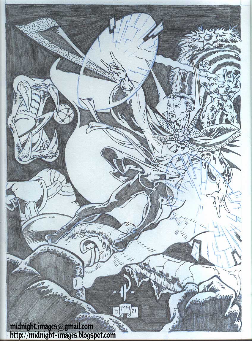 Doctor Strange - vs- Mindless Ones
May 21, 2000
graphite pencil over blue-line pencils
on vellum-finish bristol board
approximately 8 x 11.5 inches
---
 Doctor Strange - "Art Nouveau"
May 22, 2000
graphite pencil over blue-line pencils
on vellum-finish bristol board
approximately 8 x 11.5 inches
---
I don't have the originals of the finished pieces. These scans were made before I mailed the art away.
However, I do have the sketch materials and those are newly scanned.
---
As with any project of this sort, it's always best to start off with a basic thumbnail sketch.
Just a very rough concept doodle that quickly gets your idea onto paper.
This was what I first envisioned:
 ballpoint pen doodle
This rough sketch of the layout has the main figure taking up most of the cover, with open space on the left side for feature blurbs and room up top for the logo.
I almost always do my rough sketches with ballpoint pen, as I like the way the pen flows with little resistance and never requires sharpening. Although, I will admit that this thumbnail is far rougher than most that I do.
Most of the time I pour serious attention and detail into my ballpoint pen roughs.
Next, I sketched a more detailed rough image, in the appropriate size of what the final image should be.
 pencil rough sketch
This was pretty much what I wanted, but I had a few things that required tweaking.
One of which was the lighting style for the fingers on his left hand.
So, I quickly worked up these two slight variations to see which one would look best to me.
 subtle variations of lighting fx
It seems that I obviously favored the one on the left, because I didn't even continue finishing the other one.
That decision made, I proceeded to work up the final piece, first by drawing everything in light blue pencil.
 blue pencil drawing
There are two reasons why I use blue pencil for the preliminary drawing;
- - it's outdated now, with the advances of color copying and scanning, but in "pre-computer" days, blue lines didn't photocopy or print. So if an artist worked his original pencils in blue, and then they were inked over in black india ink (as was the common practice) and printed, only the black ink work would print - the blue lines not being able to be "seen" by the printer. It's a habit I never stopped. It still works a bit now, because the blue lines can be made very faint and still won't show up (or can be removed in photoshop).
- - much like the ballpoint pen, the blue pencil flows smoothly over the paper - its "lead" being more waxy than traditional black graphite pencils.
Finally, I went over the blue-lines with black pencil to create the "finished" product.
(I put "finished" in quotes because normally, it would then be inked and then colored - AND also because I didn't feel it really was quite complete.)
Doctor Strange - cover 1April 13, 2000
graphite pencil over blue-line pencils
on vellum-finish bristol board
approximately 8 x 11.5 inches
---
I still felt that it needed something.
But, I had other projects and work that would take me away from this project for about a month, and I would return to it as soon as I could.
Knowing that a background image or pattern would help complete the work, and that if it were to be used as a cover it could be reduced in opacity to prevent it from being too distracting, I produced a second drawing working from the rough original and added a nice element of design that really tied it all together.
 blue pencil drawing
---
The primary design element in that new background is of a familiar nature for that character, being the window-shape of his home. The border-element is one that I created, utilizing a basic design aspect of the "Eye of Agamotto" medallion that he wears about his neck. Thus I was able to create an interesting background that would resonate with those familiar with the character, while being visually interesting to those who might not know anything about him.
Doctor Strange - variant backgroundMay 20, 2000
graphite pencil over blue-line pencils
on vellum-finish bristol board
approximately 8 x 11.5 inches
---
At the same time that I was reworking ideas for a background design on that piece, I also had the need to create new and better illustrations (as like many artists, once I was finished with the previous one, I saw all the flaws present and hated it).
Knowing that, like my intricate design background of the earlier drawing, the publisher could easily reduce the opacity of any part of the drawing and have the main figure remain at 100%.
So, to that extent, I went a little crazy and produced a other-dimensional battle scene.
 blue pencil rough lines with graphite pencil and black felt tip marker on sketchbook paper
---
If you take a close look at this sketch, it has many layers of line-types all reworking toward a cohesive final image.
The blue pencil lines are wild and rough, placing figures and things in approximate areas. The black pencil adding tighter details and finalizing placements. The felt-tip marker adding final details and outlines.
This was actually one of two simultaneous roughs for that drawing, as I also worked a "naked" body drawing for the main figure on a separate sheet of paper. It's good practice to draw an accurate human form and then build the clothing over it. Especially if, like this character, the costume is loose and flowing.
 blue pencil rough
(note the added hands - which were for the last of the 4 illustrations - as you'll see.)
No idea why I burnt the corner of the paper.
---
Then, I redrew it all, tightening up all the details and elements, in blue pencil...
 blue pencil on bristol board
... and then went over it all in black pencil to finalize.
 blue pencil on bristol board
... and then went over it all in black pencil to finalize.
Doctor Strange - vs- Mindless OnesMay 21, 2000
graphite pencil over blue-line pencils
on vellum-finish bristol board
approximately 8 x 11.5 inches
---
Knowing that I got a little carried away with that previous image, I thought I had best work up one final image, more traditional in nature to a magazine cover, but still with an interesting background design.
I've long been a fan of the "Art Nouveau" style made famous by artist Alphonse Mucha, and thought that its flowing and intricate style would be a perfect fit for a sorcerer like Dr. Strange. So, I started working on the new image with that in mind.
 blue pencil rough
Starting with a basic concept sketch, I just roughed in the figure and some approximation of design elements. This more or less gave the feeling of what I was looking to accomplish.
However, it wasn't close to being right.
Several things irked me:
- - the gesture of the right hand
- - what to do with the left hand
- - the right leg.
- - the flow of the cloak
- - the background
Yeah, pretty much everything.
So, I reworked it in another sketch.
 blue pencil and black pencil sketch
---
You'll note that there are several erased versions of the right hand. I eventually chose hand poses that I doodled on a previous rough (of the nude figure drawing - I recycle paper whenever I can - many of these drawings being done on the back of other scrap paper or printer paper). Those hands really worked well for me. I also adjusted the flow of the cloak (on the left of the illo) to curl up towards the camera and tilted the body into more of a floating reclined position.
Still, the right leg wasn't quite right.
So, I quickly worked up a rough of the body and drew in a better leg.
 blue pencil on tracing paper
---
Liking that leg far more than the others, I reworked it into a new sketch, and added an intricate background element.
 black pencil figure with blue line background
---
The background design utilized various elements that are taken from this character.
The repeating circular patterns are (like the background of the first drawing) stylized aspects of the "Eye" amulet he wears, the pointy "demon-shape' that leads from each towards the center is the character's chest emblem and the outer ring has the repetitive scrollwork that is reminiscent of the detains on the border of his cloak, and barely noticeable, between the outer scrollwork and the inner "Eye" designs is a pointy shape that is a allusion to the cowl/high-collar that sits atop his cloak.
Still, if you can believe it, I thought it was missing something, and worked up a traditional Art Nouveau border design into my "final" blue-line art. I also tossed in a rough idea for a possible "Art Nouveau" style logo.
 blue pencil on vellum-finish bristol board.
---
However, still something wasn't right.
Realizing that this character almost needs to have that window design somewhere, I traced the border onto a beat up sheet of tracing paper, and drew in a stylized version of the window design that also had an interlocking motif, allowing it to be seemless in the overall design.
I decided that it would look best in the center section of the border.
 blue-pencil on tracing paper
---
Happy with the new design I altered it when it came time to add the black pencil work (but if you look closely, you can still see the erased lines of the aborted original design).
Doctor Strange - "Art Nouveau"May 22, 2000
graphite pencil over blue-line pencils
on vellum-finish bristol board
approximately 8 x 11.5 inches
---
So, that was it.
It took a couple of days to sketch it all out, but once the preliminary design work was done, it was a simple matter to bat out the final pieces.
Next time, I'll continue with comic book style artwork, but I'll delve into the archives of my actual comic book pages (what they call "panel-by-panel continuity") drawings.
I have several submission samples to show as well as artwork that I had produced which actually saw print in real comic books.
I'll also feature other types of professional works here as well - storyboards, book covers, product renderings, package designs and more (in case comic book style art doesn't interest you).
All in good time.
I hope you enjoyed this post and found the behind-the-scenes design sketches to be informative.
Thanks for stopping by.
2 comments:
I'm a fellow artist (and a fan of ROM ) who found your blog through another blog you made some comments on featuring ROM Spaceknight art. i like a lot of your Dr. Strange renditions. really good stuff. did you know during the ROM series Dr.Strange and ROM teamed up at least a couple of times?
Oh, SURE I know.
For you see, I happen to be a HUGE fan of ROM.
Have ALL of his appearances and anything to do with him (all cross-overs, appearances, mentions, and guest-star stuff with other characters, like the Torpedo and Hybrid).
Anyway, that's not all, but I'll send you an email to chat further.
Thanks for the kind words about my artwork.
I've been away from this blog for awhile, but I'm coming back to it.
Post a Comment